Shopping Cart
Your cart is empty.
Search Products
Shopping Cart
Your cart is empty.
Search Products
Most people spend a lot of time choosing the perfect artwork or photograph to display. Many of them forget that the mount colour is what truly completes the picture.
A well-chosen picture mount colour does far more than fill the space between your artwork and its picture frame. It naturally draws the eye to your print. Moreover, it creates visual balance and adds a layer of depth that makes the entire display feel intentional and considered.
Here's exactly what the right mount colour can do for your display:
Ultimately, the mount colour is a small decision that makes a big difference. Getting it right elevates not just your artwork, but your entire space.
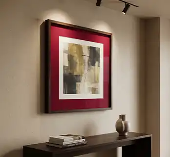
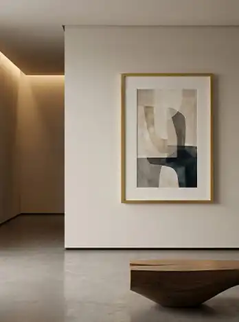
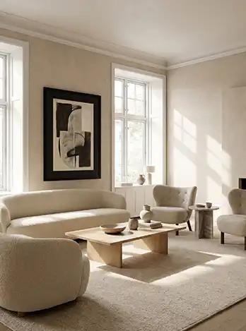
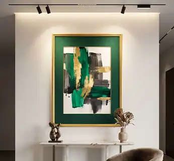
Every colour in our collection has been carefully selected to cover the full spectrum of framing needs. From clean and neutral to bold and expressive, we have everything to accommodate a picture frame and the art that it presents. Whether you're framing fine art, family photography, or decorative prints, there's a mount colour here that will bring your display to life. Here's a closer look at each one:
Ivory is a warm, gentle off-white that adds a soft, timeless quality to any framed display. Unlike pure white, its subtle warmth makes it incredibly forgiving across a wide range of artwork styles and interior tones.
It works beautifully with vintage prints, botanical illustrations, sepia photography, and hand-drawn artwork. If your interior leans toward natural materials, warm wood tones, or a classic country aesthetic, the Ivory mount is an effortlessly elegant choice.
Poppy Red is for those who want their display to make a real statement. It is bold, energetic, and impossible to ignore. This vibrant, true red adds a striking pop of colour that instantly draws the eye and brings life and energy to any wall.
This mount colour works particularly well with black-and-white photography, graphic art, and typographic prints, where the contrast between the picture mount and the artwork creates a dramatic, high-impact display.
Crimson is a deep, rich red, with warmth and sophistication running through every inch. Where Poppy Red is loud and vibrant, Crimson is refined and dramatic. It adds depth and intensity without overwhelming the artwork.
This picture mount colour pairs exceptionally well with dark wood frames, moody oil paintings, classic portraiture, and any artwork with warm undertones. It is ideal for formal living rooms and dining rooms, as well as for anyone looking to add a touch of luxurious drama to their display.
Pompadour is a soft, dusty blue-grey with a quiet, sophisticated character. Muted and calm rather than vibrant, it sits closer to a slate or steel blue than a true pastel, giving it a versatile, understated elegance.
This picture mount colour works particularly well with coastal photography, contemporary artwork, and architectural prints, where a cool, composed tone suits the subject. It also complements calm, modern interiors and pairs naturally alongside silver or grey-toned photo frames.
Ice White is the crisp, clean, pure white mount that has become a staple in modern and contemporary picture framing. It's sharp, fresh, and incredibly versatile. Moreover, it works seamlessly with almost any artwork style, picture frame colour, and interior design.
If you want the focus to remain entirely on the artwork, with no distractions, Ice White is the most reliable choice. It's particularly popular in minimalist interiors, gallery-style displays, and modern homes where clean lines and simplicity are key.
Our Blue Mount is a cool, confident mid-tone that brings a calm and collected energy to any display. It pairs naturally with coastal and nautical photography, watercolour artwork, landscape prints, and any imagery featuring water, sky, or natural scenery.
In an interior context, Blue picture mounts work beautifully in living rooms and bedrooms where a relaxed, serene atmosphere is the goal. It also contrasts strikingly with warm-toned artwork, adding an unexpected yet harmonious visual tension.
Silver brings a sleek, contemporary edge to any framed display, sitting somewhere between the neutrality of Grey and the cool sheen of a metallic finish. It works exceptionally well with modern and industrial-style interiors, abstract photography, architectural imagery, and any artwork that features cool or metallic tones.
Paired with silver or aluminium picture frames, it creates a seamless, gallery-quality finish that feels current and sophisticated. If your interior is modern, minimal, and design-led, Silver is a natural choice.
Mid Grey is the understated workhorse of the mount colour world. It is quietly sophisticated, endlessly versatile, and always dependable.
This picture mount colour sits perfectly between white and black. It makes it an ideal neutral choice when you want something with a little more depth than white but without the boldness of black.
Moreover, it is the go-to choice for black and white photography, architectural prints, and contemporary artwork. Mid Grey also works exceptionally well in modern office spaces, urban-styled interiors, and any setting where a cool, refined aesthetic is the goal.
Black is the classic, timeless mount colour that has stood the test of time for good reason. It creates a strong, defined border around your artwork.
This picture mount adds contrast, making the colours in your print appear more vivid and intense.
Black mounts work with an enormous range of artwork styles. From fine art photography and graphic illustration to bold paintings and typographic prints, it suits every photograph. They're also the natural companion to black picture frames, creating a sleek, unified look that feels polished and professional.
Emerald green is a deep, jewel-toned green that exudes richness, luxury, and natural sophistication. It's a bold choice, but one that pays off especially when paired with the right artwork and setting.
Nature photography, botanical prints, wildlife illustration, and abstract art all look stunning against an Emerald mount. In interior terms, it complements dark, moody spaces beautifully and adds a rich touch to any gallery wall or statement picture frame.
If you want your display to feel truly special, Emerald delivers.
Antique White is a soft, muted off-white with a gentle aged quality that sits between the crispness of Ice White and the warmth of Ivory. It has a quiet, heritage feel that suits artwork with a sense of history or nostalgia.
This picture mount colour works particularly well with heritage photography, vintage documents, antique prints, and botanical illustrations. It also complements farmhouse, cottage, and shabby-chic interiors, where a soft, lived-in palette is part of the appeal.
Forest Green is a deep, muted green that draws its character from woodland and countryside tones. Where Emerald is bold and jewel-like, Forest Green is earthier and more understated, adding warmth and depth without demanding attention.
This mount colour pairs naturally with nature photography, countryside and hunting prints, autumnal artwork, and rustic or cabin-style interiors. It also works well alongside walnut, oak, dark oak, and rose wood picture frames, where the two tones sit together comfortably.
Charcoal Grey sits just a shade lighter than true Black, offering the same strong, contemporary edge with a touch more softness. It creates a defined border around your artwork without the starkness of pure black.
This picture mount colour suits moody photography, architectural prints, industrial-style interiors, and contemporary artwork particularly well. It also works well in modern office spaces and urban settings, where a cool, refined finish is the goal.
Antique Gold brings a warm, muted metallic tone to your display, evoking old-world elegance and understated luxury. It has a soft glow rather than a bright shine, giving it a refined, timeless character.
This mount colour is a natural match for classical art, oil paintings, religious or heritage imagery, and formal portraiture. It also pairs beautifully with gold or Ornate Gold picture frames, creating a cohesive, luxurious finish.
Primrose is a soft, pastel yellow named after the delicate spring flower, bringing a gentle, cheerful quality to any framed display. It is bright enough to lift a room without feeling overpowering.
This picture mount colour works beautifully with botanical art, nursery prints, children's illustrations, and spring-themed photography. It also suits coastal and cottage interiors, where light, airy tones set the mood.
Burnt Orange is a warm, earthy tone with a rich, autumnal character. It adds depth and warmth to a display without the boldness of a brighter orange, making it easier to live with over time.
This mount colour pairs naturally with autumn photography, retro and vintage prints, and bohemian-style artwork. It also complements warm, earthy interiors, where terracotta, rust, and natural wood tones are already at play.
Bright Yellow is a bold, true yellow that brings energy and personality to any framed piece. It is a confident choice, similar in spirit to Poppy Red, but with a lighter, more playful character.
This picture mount colour works particularly well with pop art, graphic prints, and children's artwork, where a strong pop of colour is welcome. It also suits maximalist and playful interiors, where bold colour choices are part of the design.
Pacific Blue is a rich, saturated blue with more depth and vibrancy than our standard Blue mount. It brings a confident, statement-making quality to any display, evoking open water and clear skies.
This mount colour is a natural fit for coastal and travel photography, seascapes, and bold abstract prints. It also works well in interiors where blue is already a key part of the palette, adding richness rather than a subtle accent.
Burgundy is a deep, wine-toned red with a purple undertone, offering a more sophisticated alternative to Crimson. It brings warmth and richness to a display, with a slightly darker, more formal character.
This picture mount colour suits moody florals, classic portraiture, and dark, atmospheric artwork particularly well. It also complements formal dining rooms and studies, where a sense of depth and luxury is the goal.
Sage Green is a soft, muted green with a grey undertone, offering a calming, understated alternative to Emerald or Forest Green. It has become a firm favourite in modern interiors thanks to its natural, easy-going character.
This mount colour pairs beautifully with botanical prints, watercolour art, and calming nature photography. It also works particularly well in Scandinavian and minimalist interiors, where soft, natural tones are key.
Damson is a deep, plum-toned purple with real depth and character, named after the rich, dark fruit. It adds a moody, dramatic quality to a display without straying into pure black or grey.
This picture mount colour works particularly well with floral art, autumnal and winter-themed prints, and bold, contemporary artwork. It also suits dramatic, richly decorated interiors, where deep, saturated colours are embraced.
Dusty Rose is a soft, muted pink with warm grey undertones, offering a gentle alternative to our bolder pinks and reds. It has a quiet, sophisticated character that works well across a range of styles.
This mount colour suits romantic photography, vintage-style prints, and soft floral artwork particularly well. It also complements blush and neutral interiors, where a subtle touch of colour is all that's needed.
Choosing the right mount colour doesn't have to be complicated, but it does deserve a little thought. The colour you choose will influence how your artwork is perceived, how it sits within your space, and how the overall display feels to anyone who looks at it. Follow these practical tips to make the right choice with confidence every time.
The simplest and most reliable starting point is to look at the colours already present in your artwork. Pick out a dominant or recurring tone and choose a mount that either reflects or complements it.
A landscape photograph with deep greens and earthy tones, for example, pairs naturally with Ivory or Mid Grey. A bold, colourful abstract print might shine brightest against a clean Ice White or Black mount that lets the artwork do all the talking.
Ivory, Crimson, or Burnt Orange work beautifully.
Ice White, Blue, Silver, Mid Grey, Pompadour, or Pacific Blue are natural fits.
Black, Mid Grey, Charcoal Grey, or Ice White creates the strongest impact.
Ice White or Black keep the focus firmly on the artwork.
Using a mount colour that complements the tones in your artwork helps create a balanced, visually pleasing framed display.
When choosing a picture mount colour, there are two common approaches. Both work well depending on the look you want to create.
It means choosing a mount colour that blends well with the colours already present in your artwork or interior. This approach creates a calm, balanced, and elegant display, which works especially well in classic or traditional settings.
For example, an ice white mount around minimalist art creates a soft effect.
It means selecting a mount colour that clearly stands out from the artwork's colours. The contrast adds visual interest and makes both the artwork and the mount more noticeable.
For example, a Poppy Red mount around a black-and-white photograph can create a bold, striking display.
You should never choose your mount colour in isolation. Always consider the room it will live in. Think about your wall colour, furniture tones, existing décor, and the overall mood of the space.
Almost any mount colour works, giving you full creative freedom.
Lighter mounts like Ice White or Ivory create contrast and prevent the display from disappearing into the wall.
Ivory, Crimson, and Burnt Orange blend naturally into the space.
Ice White, Silver, Mid Grey, Charcoal Grey, Pompadour, and Black feel right at home.
Bold colours like Emerald, Poppy Red, Blue, Bright Yellow, or Damson add vibrancy to the room.
Thinking about the room as a whole helps ensure your framed artwork feels balanced and naturally connected to the rest of your space.
The frame and mount work together as a unit, so it's important to consider them side by side. A mismatched frame and mount combination can undermine an otherwise great display, while a well-paired combination elevates everything.
Pair with Black, Charcoal Grey, Mid Grey, Ice White, or Silver mounts for a sharp, cohesive look.
Ivory, Ice White, Antique White, and Pompadour sit beautifully within lighter photo frames
Ivory, Crimson, Forest Green, and Emerald complement the richness of dark timber.
Ivory, Crimson, and Antique Gold bring out the warmth of metallic photo frames.
Silver, Pacific Blue, Ice White, Mid Grey, and Pompadour create a seamless, contemporary finish.
When in doubt, Ice White and Ivory are the two most universally flattering mount colours and work across almost every artwork style, frame colour, and interior setting.
They're the perfect starting point if you're new to framing or want a safe, reliable choice that always looks great.
These are the two most universally flattering mount colours and work beautifully across almost every artwork style, frame colour, and interior setting.
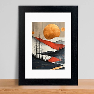
The right mount colour helps artwork feel naturally connected to your space instead of visually disconnected.
One of the biggest advantages of shopping with ProCut Global is that you never have to compromise. Every single one of our 22 mount colours is available across our complete range of standard sizes.
We have a wide range of A, Metric, and Imperial measurements for picture mounts. Whether you need a small 5 x 5 imperial mount or a large 100 x 70 cm metric mount, you can have it in any colour you choose, every single time.
Our standard size range covers over 55 size combinations, including:
No matter which size and colour combination you need, it's all available in one place.
Can't find the exact size you're looking for? Order made to measure picture mounts directly through our website. Browse our full Standard Size Picture Mounts Collection to explore all available sizes.
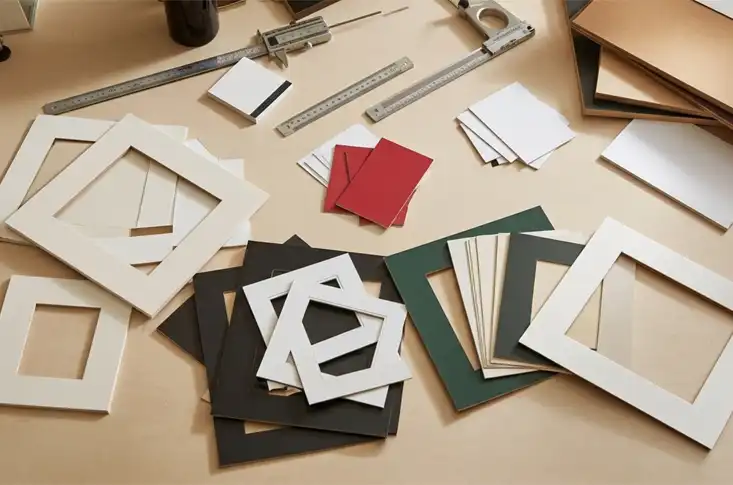
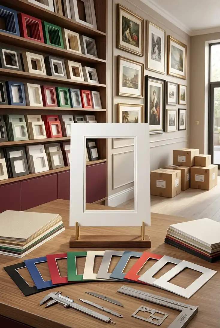
We know you have options when it comes to buying picture mounts. So, here is why thousands of customers trust ProCut Global for their framing needs.
From vibrant statement colours to classic neutral tones, ProCut Global delivers the quality, range, and reliability to frame your artwork exactly as you want.